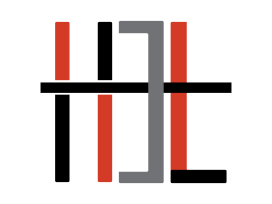
The 2014-2015 Burlington High School Help Desk staff continues to produce exemplary work and today’s post serves as yet another example of student creative genius and innovation. After only a brief consultation regarding giving the 2014-2015 Help Desk Live logo a fresh new look, as well as the creation of a brand new introductory trailer to our weekly show, senior Help Desk member Hammad Sadiq took to the creative drawing board. The post below highlights his impressive creations, the steps he took (from concept to finished product) to design both the logo and the introductory video, and most importantly, what he learned by completing this independent project.
This post originally appeared on Hammad Sadiq’s blog:
Learning How to Make a Great Looking Intro

2013-2014 Help Desk Live logo Created by: Harsh Dedyiha & Amit Patel, BHS Class of 2014
This week was definitely a busy week at Help Desk as I was assigned the task of redesigning the Help Desk Live logo and working on an introduction for help desk videos. My design process began with taking the old logo (show above) and making a few sketches as to what the new logo should look like (shown below).

2014-2105 Help Desk Live logo Created by: Hammad Sadiq, BHS Class of 2015
I spent some time looking at logos of tech companies and realized that they all employ a minimalist design theory to their logos. After numerous designs, I finally decided on the design below. It was part minimalist and got the idea across. The color scheme was another challenge, so I decided to go with the school’s colors. You might notice some black on the logo well that was to make it more appealing as red and white was not as visually appealing.
![]()
Then came the process of making an animated introduction. I am sure there are better methods for making introductions, but I chose Adobe Flash CC. This is the software that I am most comfortable with and understand the most. I have some experience animating so making the intro was surprisingly fun.

The end product came out nicely in my opinion. I also chose to use the futura font that added to the modern aesthetic that I was striving for.
Here is what the final intro looked like:
